My hand-drawn Doodle Bundle for "Inspired Ideas" • click image below to purchase 22-pc set •


- Pamela Jane
- Around my day jobs as interior designer, gallery director, product stylist and so on, I've painted. In 2014, I started building my beautiful new painting studio.
creativity is intelligence having fun -albert einstein .


COVER PHOTO, MASTERING THE ART OF FRENCH EATING, ANN MAH (HARDCOVER & AUDIO), PENGUIN Sept 2013

CONTRIBUTING ARTIST IN CRAFT-A-DOODLE, by JENNY DOH, AUGUST 2013

Die Series with Eileen Hull: "HOLIDAY WISH BOX" @ ANGELA'S HAPPY STAMPER, DECEMBER 7, 2013

Die Series with Eileen Hull: "CUTTING FLOWER GARDEN"@ ANGELA'S HAPPY STAMPER, JUNE 25, 2013

Die Series with Eileen Hull: "Sentiment Box" @ Angela's Happy Stamper, April 9 & 13, 2013

"Doodle Amour" workshop @ French General, LA, Feb 9, 2013

Die Series with Eileen Hull: "Doodled Holiday House" @ Angela's Happy Stamper, Dec 1, 2012

"Doodle Ink" Workshop @ Handmade U 2012, Omaha

autumn banner tutorial

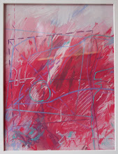
pastels